
Did your site survive Mobilegeddon 2015?
On April 21, 2015, mobile web surfers exhaled a sigh of relief, and businesses held their breath to see if their website transitioned over successfully into Google’s first mobile algorithm. On February 26th, Google announced it had plans to roll out an algo that would improve user experience on mobile starting on April 21. The algorithm would fix issues like broken links, slow-loading media, too-small text, etc. by favoring mobile-friendly sites in mobile rankings in order to generate the most relevant and timely results for users. What would be called Mobilegeddon by webmasters and media outlets hit on the week of April 21st and will continue to hit hard over the next few weeks.
Don’t think that mobile results matter for your business? Think again. According to ClickZ Marketing News and Expert Advice, half of all Google searches come from mobile devices. Starting to sweat a little? Don’t worry. We have your back.
If your website passed the algorithm test, congratulations! If not, we have some easy tips and steps for you to take in order to fix the issues and get your website back in the mobile ranking game.
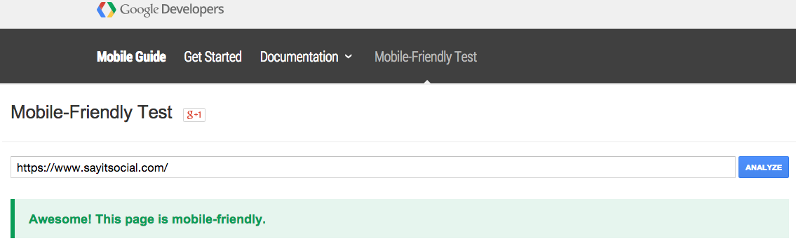
1. Check to see if your site is mobile-friendly– Not only are mobile-friendly sites now supported by Google in the ranking area, but responsive-designed mobile-friendly sites also provide a better experience for those browsing on their smartphones which can help decrease bounce rates and increase user engagement and conversion from mobile. Google provided websites with a Mobile Friendly Test Tool that would analyze a URL and report if the page had a mobile-friendly design. If your site passes the test you will get a message that says “Awesome! This page is mobile-friendly.” If not, you will see a message that says “Not mobile-friendly.” Google will provide reasons why the page isn’t mobile-friendly, and then an option to make the page mobile friendly.
 2. Make the necessary changes that Google suggests– Start by updating to a responsive design.If you edit code for websites yourself, you can use Google’s Technical Guides to take you through the process of making your site mobile-friendly step by step. Creating a mobile-friendly site requires attention to detail and advanced web developing skills, so if you do not feel comfortable trying to fix the problems on your own, send the required changes to your web developer. Remember to avoid unplayable content, mobile-only 404s, irrelevant cross-links, slow loading pages, and to set up redirects properly.

3. Run the Mobile Usability Report in Webmaster Tools– Once you or your web developer has made the necessary changes in order for your site to be mobile-friendly, take the Mobile Usability Report to ensure that all of the changes have made your site mobile friendly. Once you’re in the clear, you officially have a mobile-friendly site!
4. Wait for Google to re-crawl your site– Once your site is mobile-friendly, Google will automatically re-crawl and index your pages so that they transition into the new mobile algorithm. If you would like to expedite the process, you can use “Fetch as Google with Submit to Index” so that your page is listed sooner.
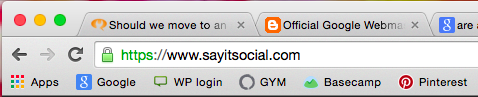
5. Make sure that your site is secure– By switching your site from Http to Https, Google will also reward you with a ranking boost. Https stands for Hyper Text Transfer Protocol Secure, which provides users with web security when it comes to giving/receiving information. The encrypted connection that Https sites contains makes it more difficult for hackers and others to track users. Benefits other than a ranking boost include privacy and gaining referral data. If you’re on a Http site you will know by seeing the green lock and https in the search bar where a website address is listed.
Like Google mentioned in pretty much all of its announcements about Mobilegeddon, the changes on mobile will take a few weeks to roll out- so if you think you’re in the clear without a mobile-friendly site, think again! The algorithm change will have a huge impact, so if you haven’t already, adhere to the above steps and get your website Mobile-Friendly ASAP!
About Morgan Jones
Morgan is a graduate from the University of North Carolina Wilmington with a BA in Communication Studies and a minor in journalism. She brings to the table a vivacious spirit and unique creative energy that she uses in all things SayItSocial. When she isn't being an awesome Digital Account Executive, you can find her running the Wrightsville Beach loop with her dog Grizzly, out on the beach, or on her front porch reading her nook.
- Web |
- More Posts (22)
Like What You Are Reading? Subscribe To Read More
Join our mailing list to receive the latest news and updates from our team.
You have Successfully Subscribed!
Recent Posts

Google Launches “TV Screens Device Category”, Ad Streaming Wars Have Begun!
Tiffany Odem-Rodriquez - February 4, 2019


How to Create Limited Time Black Friday and Cyber Monday Google Ad Extensions
Tiffany Odem-Rodriquez - November 20, 2018
Google to Restructure Security Efforts after Google Plus Shuts Down
Meg Ahrenberg - October 16, 2018
What Google’s latest search engine algorithm update means for the future of marketing
Tiffany Odem-Rodriquez - August 13, 2018
5 Things Marketers Should Know about Google’s AdWords Rebrand
Tiffany Odem-Rodriquez - August 1, 2018


